Project overview
The Product
A platform for college students to easily access the latest cryptocurrencies, with minimal personal information required to sign up.
Project duration
December 2021 to June 2022
The problem
Design an account creation flow for a cryptocurrency exchange platform.
The goal
To provide focused and determined college students a platform where they can take advantage of
innovative and trendy crypto currencies without giving to much private info in the sign-up process
My role
UX designer leading the app and responsive website design from conception to delivery
Responsibilities
Conducting interviews, paper and digital wire-framing, low and high-fidelity prototyping, c
onducting usability studies, accounting for accessibility and iterating on designs.
onducting usability studies, accounting for accessibility and iterating on designs.
Understanding
the user
the user
User research summary
We are trying to create a sign-in process that is not cumbersome but is enticing and appealing to the users that we have identified as: willing to invest some of their savings but need some learning of the process of how to do it, and new possibilities through blockchain, like NFTs.
The findings will determine the degree of handholding we will have to create for the users.
pain points
1. Long process
Sign-up process needs to be shortened in order to reduce the dropout rate.
2. Privacy issues
Make sure the information needed to be collected doesn’t exceed the minimum mandatory by regulations.
Make sure the information needed to be collected doesn’t exceed the minimum mandatory by regulations.
3. Unmotivated user
The users lose their excitement in the course of the account creation process.
The users lose their excitement in the course of the account creation process.
4. Lack of vision
Show a user new horizons the blockchain technology opens up like NFTs.
Show a user new horizons the blockchain technology opens up like NFTs.
Persona
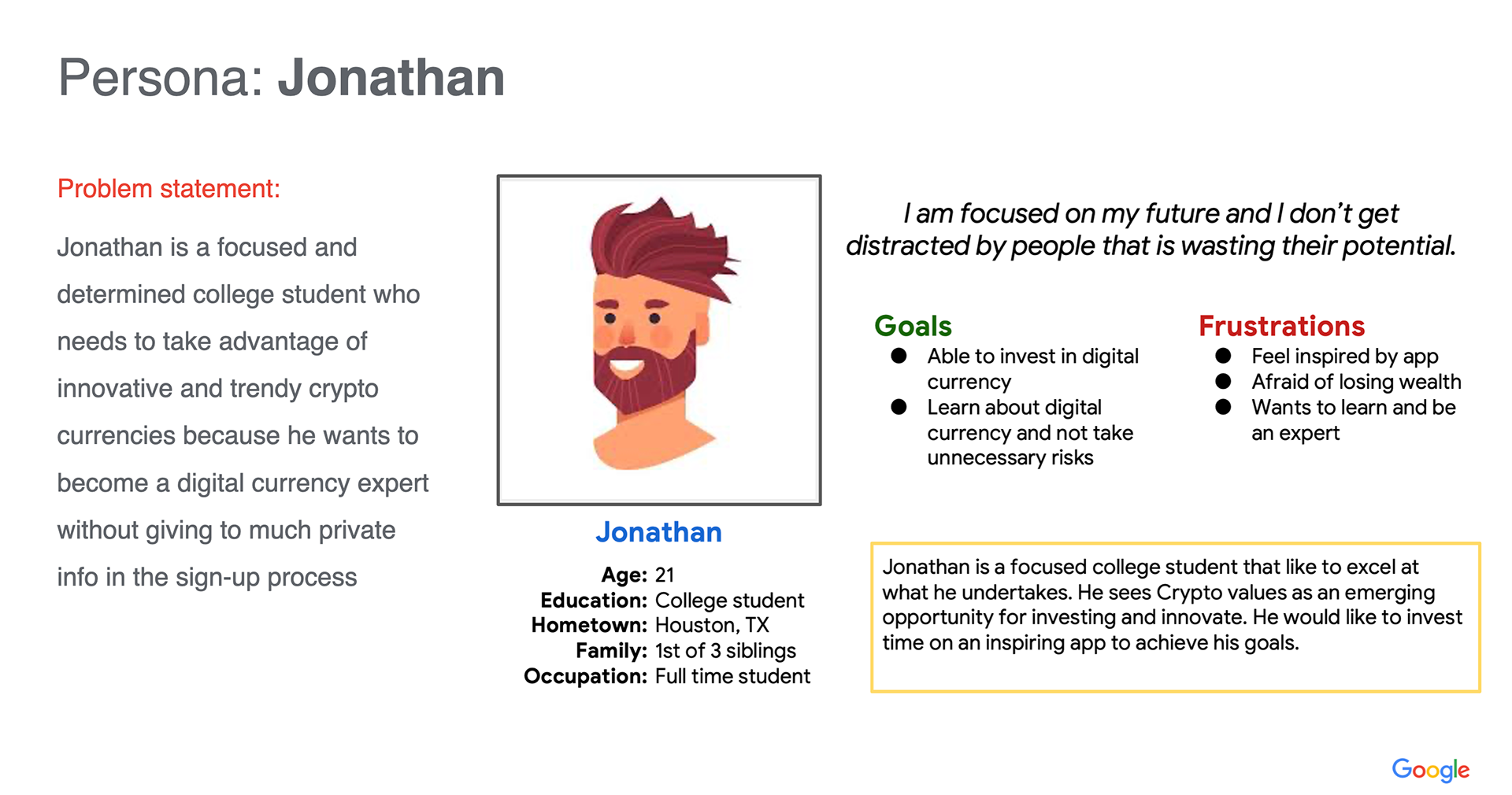
Persona 1
.
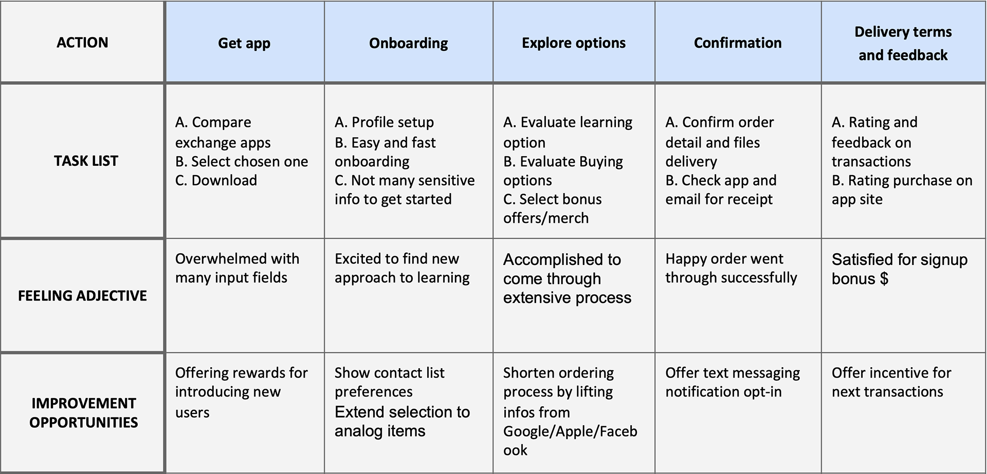
User journey map
I created a user journey map of Jonathan’s experience using the site
to help identify possible pain points and improvement opportunities.
to help identify possible pain points and improvement opportunities.
.
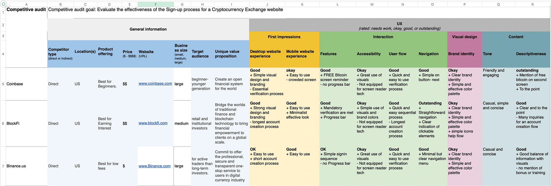
Competitive analysis
Analysis of current scenario of services (apps or websites) that provide crypto exchange.
Design stage
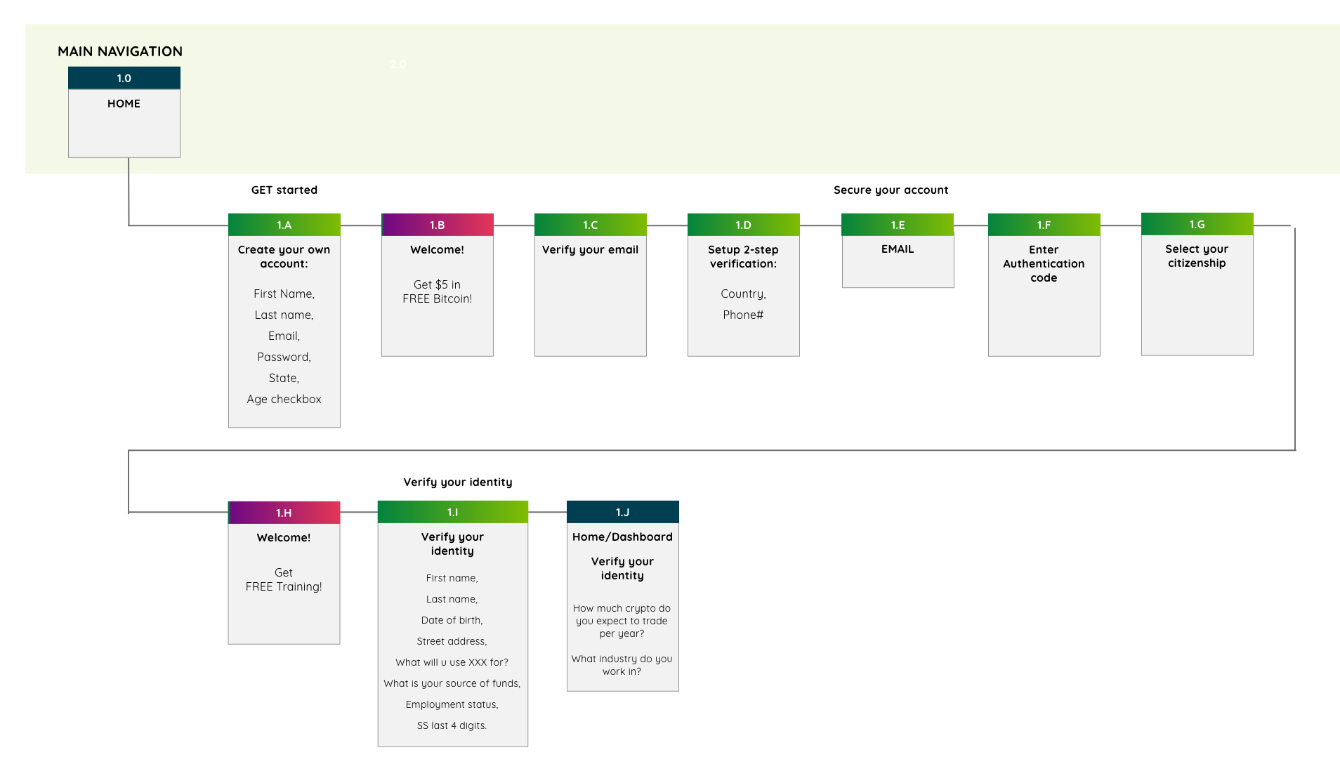
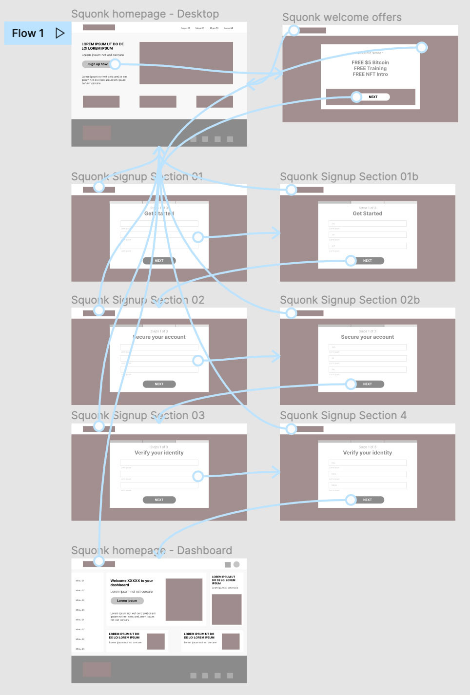
SITEMAP
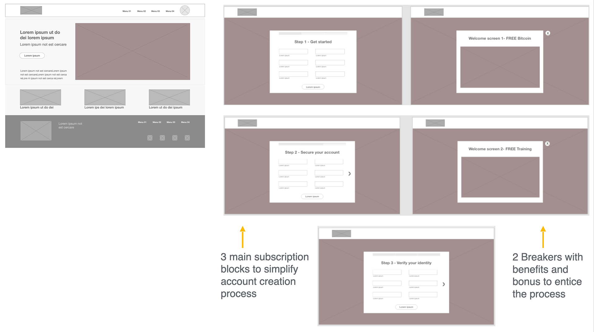
There is a plan to introduce 2-3 breakers as dividers of 3 sign-up sections.
These breakers will features incentives for the prospect members.
These breakers will features incentives for the prospect members.
.
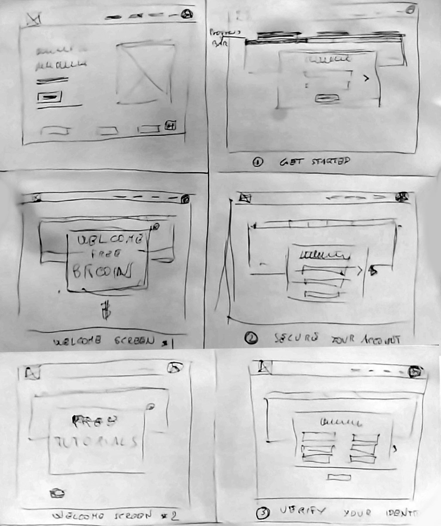
PAPER wireframes
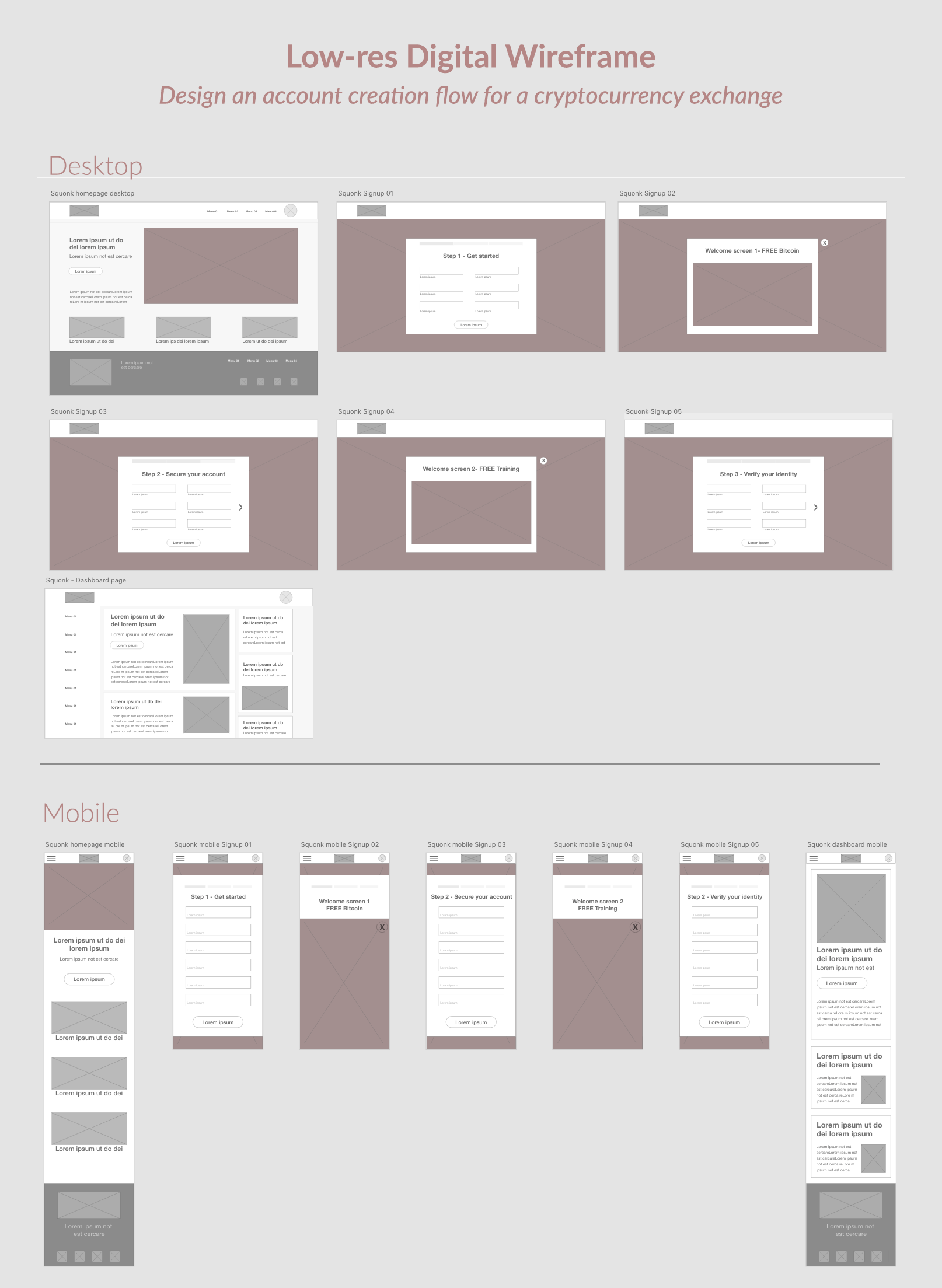
The plan is to introduce 2-3 breakers as dividers of 3 sign-up sections. These breakers will feature incentives for sign-up like free bitcoin, NFT tutorials and free training.
.
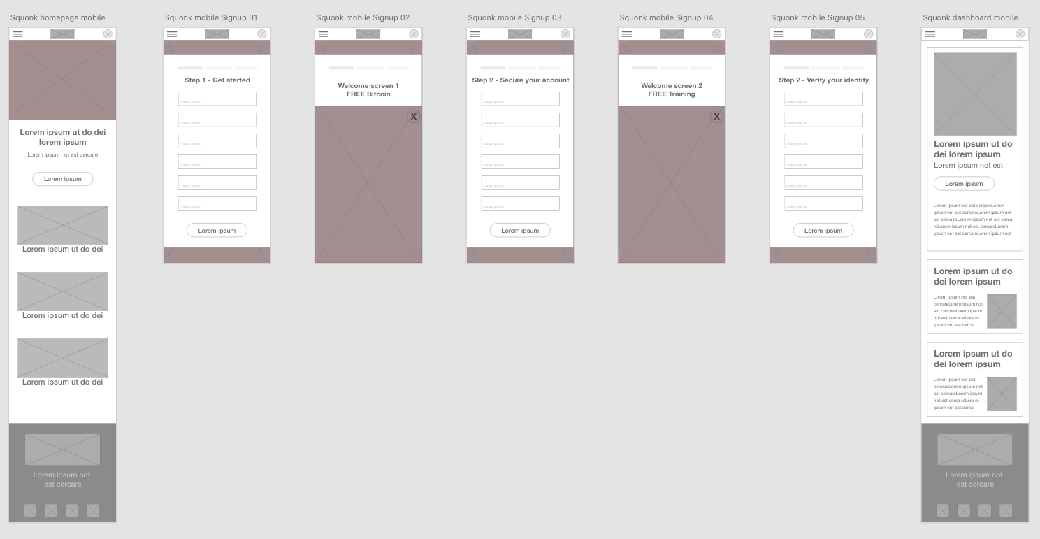
DIGITAL WIRE-FRAMES
Desktop | Mobile
.
LOW-fidelity prototype
Usability studies
Study type
30 minutes moderated usability study in New York City with 3 participants
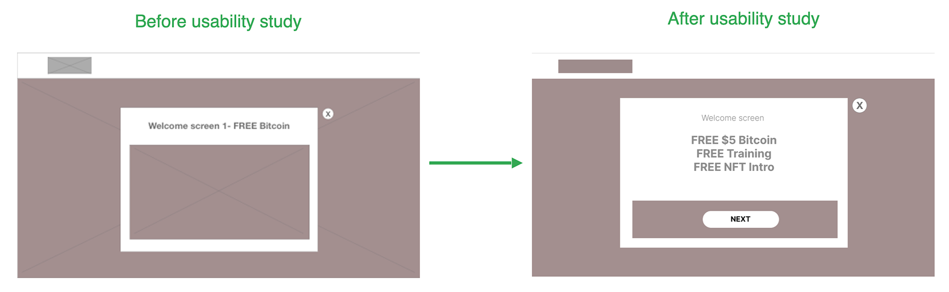
Usability study findings
1. Breakers not essential
2. Brevity of process
2. Brevity of process
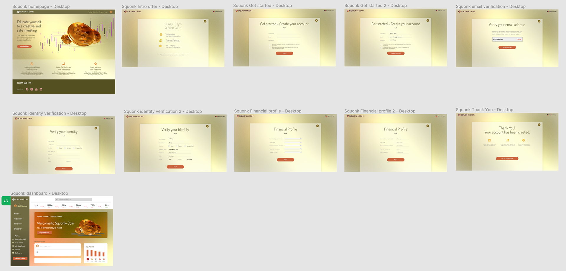
High-fidelity
prototype
prototype
Implemented peer feedback by changing the user flow of the onboarding.
Profile was expanded to include search filters through 4 steps.
Homepage visual hero was balanced with a search bar that connects to the profile.
Accessibility
considerations
considerations
1. Provide access to users who are vision impaired through adding alt text to images for screen readers
2. Maximize compatibility with current and future user agents, including assistive technologies such as screen readers and magnifiers
3. Create a distinguished layout to make it easier for users to see and hear content including separating foreground from background.
.
The designs for screen size variation includes mobile, tablet, and desktop.
The design is optimized to fit specific user needs for each device and screen size.
The design is optimized to fit specific user needs for each device and screen size.
Takeaways
Impact
The account creation flow has been simplified to make a minimal impact on the dashboard first time access.
The users are burdened by the amount of information they have to release just to get a chance to look at the main features.
What I learned:
I learned that the shortest way is of the essence since users prefer brevity rather than endlessly filling text fields.
Next steps
1. Conduct another round of usability studies to validate whether the pain points users experienced have been effectively addressed.
2. Conduct more user research to determine ideal process.
3. Redefining design until no more design updates are needed